OutBites
Tech (Phone App)
BRANDING
PRINTS
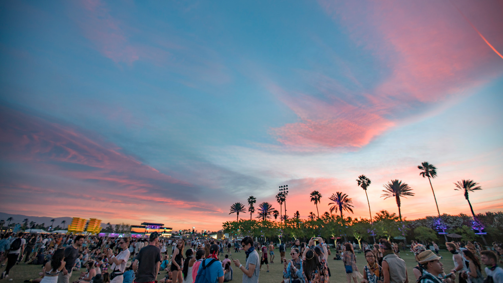
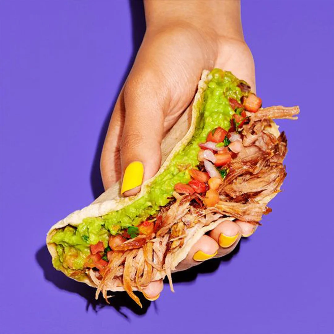
OutBites: a mobile app that transforms your festival food experience! Through OutBites, users can connect with food trucks and pop-up stalls at events like music festivals and Christmas markets. Discover real-time locations, menus, pre-order options, reviews, and social sharing—all in one place.

for the tech savvy foodies

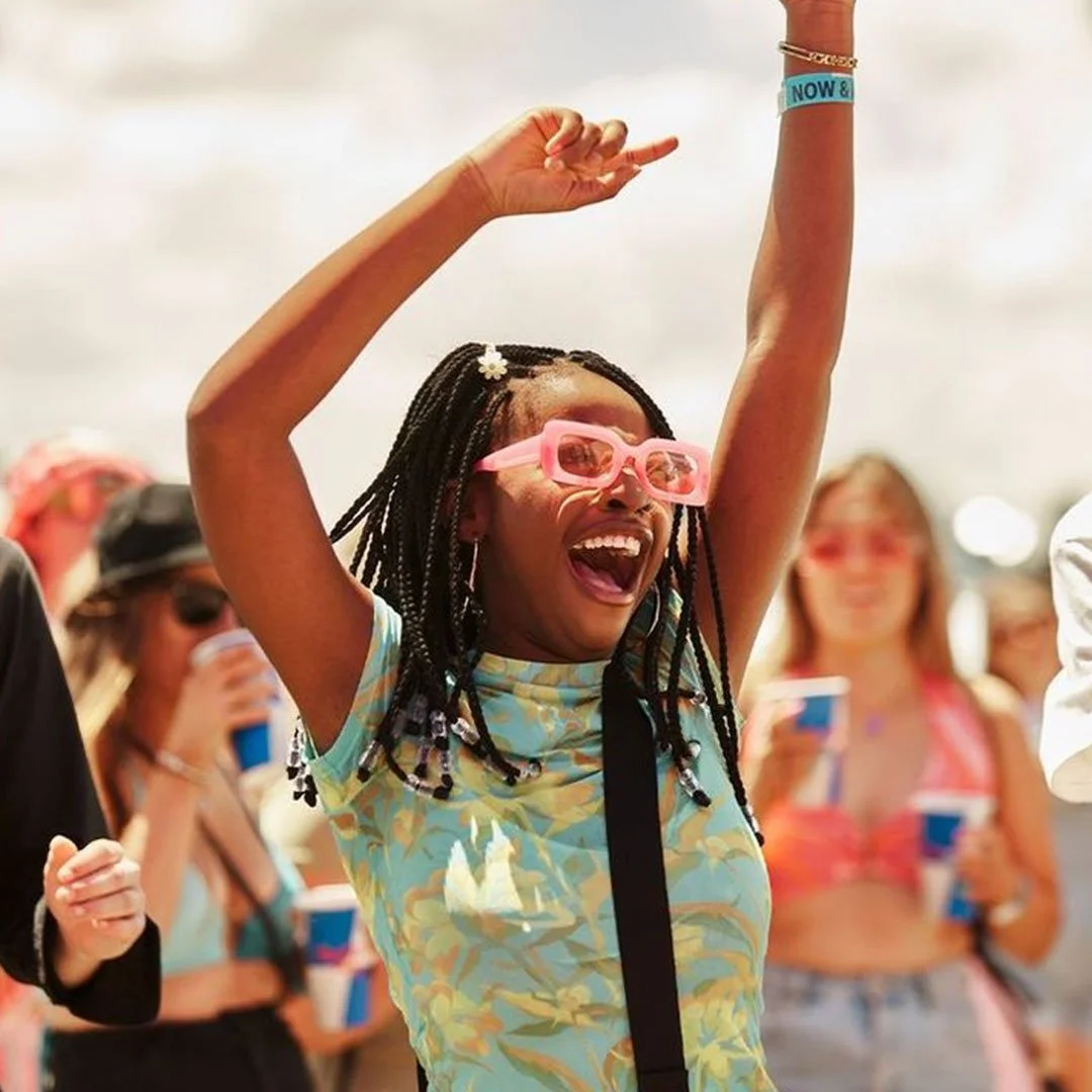
OutBites targets mainly Gen-Zers, and anybody that falls between the ages of 16-40, that are tech-savvy festival-goers and food enthusiasts. The brand needs to feel “tech” enough but at the same time look fun and colourful unlike most simplistic monotonous apps out there.
the design moodboard
SIMPLE MARK
HIGH CONTRAST

SANS SERIF FONT
CUT-OUT ILLUST.
FESTIVE & FUN
BRIGHT COLOURS
DISCOVERY
✷
FUN
✷
ADVENTURE
✷
COMMUNITY
✷
INNOVATION
✷
AUTHENTICITY
✷
EMPOWERMENT
✷
DISCOVERY ✷ FUN ✷ ADVENTURE ✷ COMMUNITY ✷ INNOVATION ✷ AUTHENTICITY ✷ EMPOWERMENT ✷
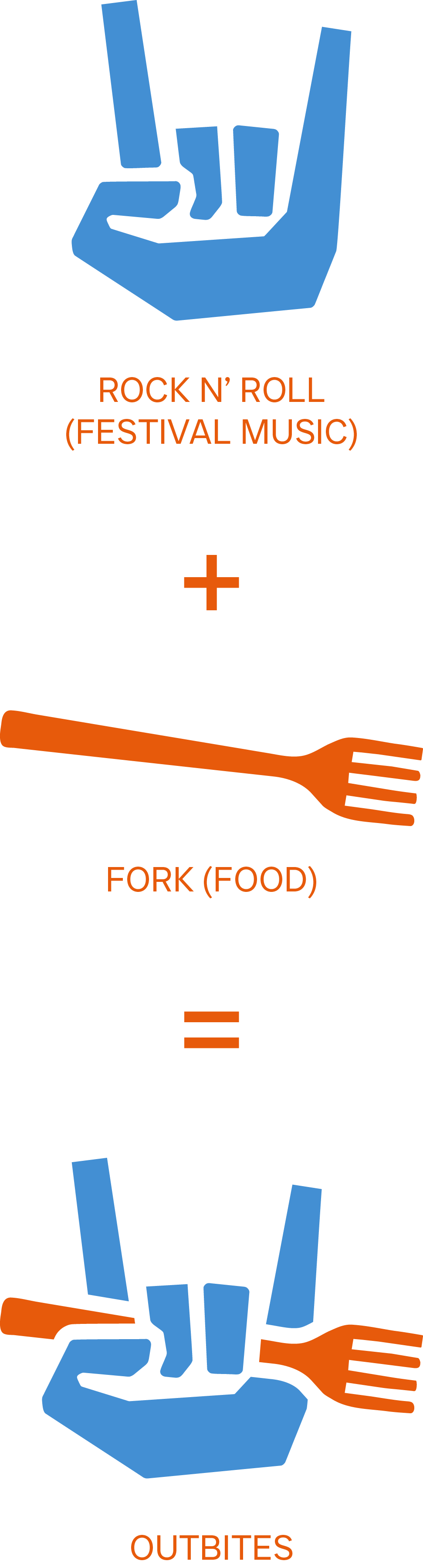
combining music & food
During the design and ideation phase, I have brainstormed multiple ideas such as having a fun mascot taking a bite out of a sandwich, or a simpler typography only logo with a “bite” being taken out of it. However, this pictorial icon combined with simple text feels most aligned with the founder’s desired tech brand image.


“tech” but colourful!
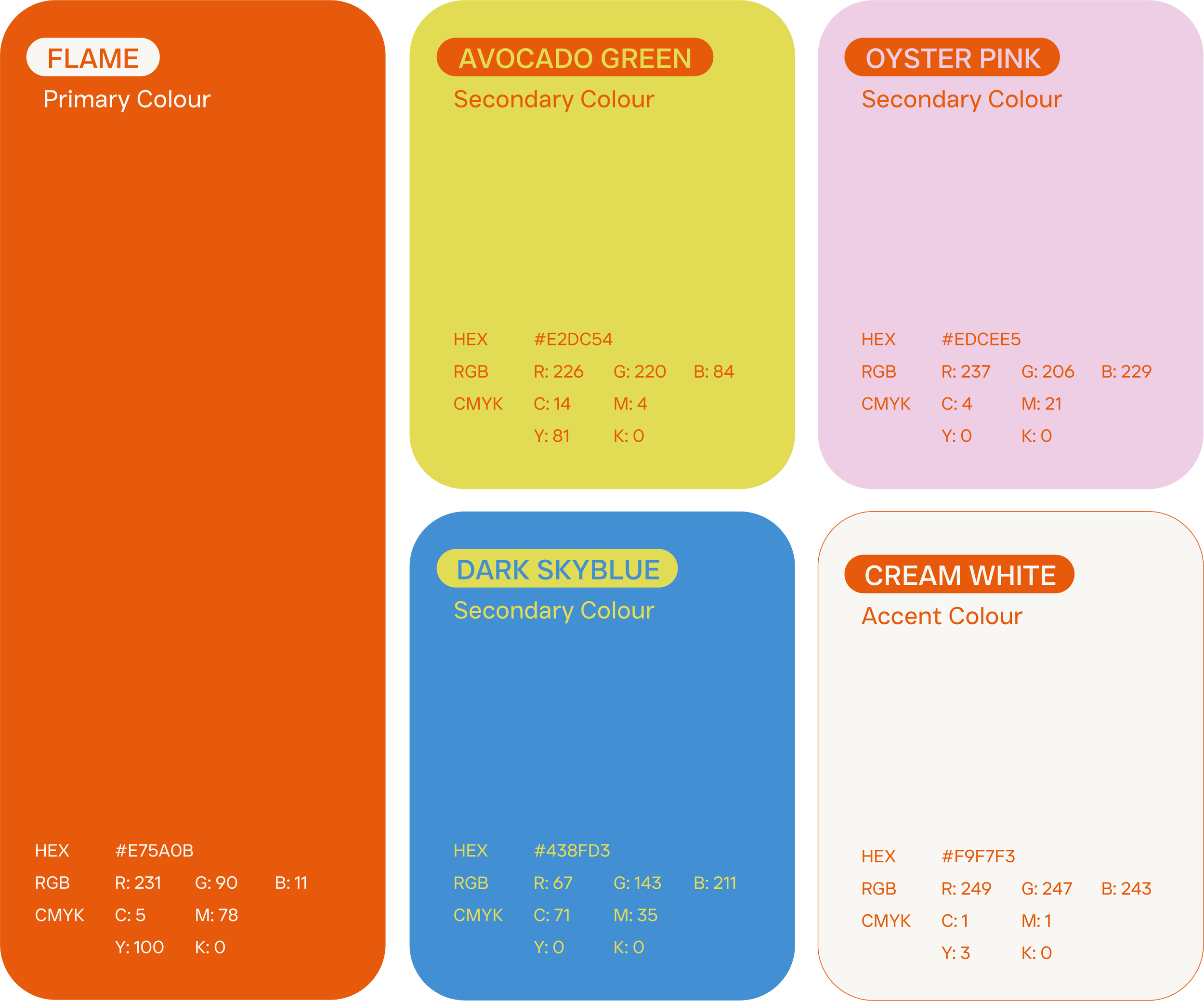
When we think of tech brand colours, what usually come to mind is b&w text, with a splash of blue, purple or green. Very simple and modern. For OutBites however, we opted for a bright and colourful palette to reference the fun, maximalist, but slightly chaotic feel of music festivals and finger-licking festival eats.

VIEW MORE
-
![]()
DIVERSE LEARNERS
WEB DESIGN & DEVELOPMENT | BRANDING | SOCIAL MEDIA
-
![]()
MIMIGRAPHY
WEB DESIGN & DEVELOPMENT | BRANDING
-
![]()
PECCO PECORINO
BRANDING | SOCIAL MEDIA | MENU DESIGN | PACKAGING
-
![]()
CHATTERBEANS
BRANDING | ILLUSTRATION
-
![]()
PLAY BEYOND
WEB DESIGN | BRANDING | SOCIAL MEDIA | PACKAGING | PRINTS
-
![]()
ADRIAN NG PHOTOGRAPHY
WEB DESIGN & DEVELOPMENT | BRANDING
-
![]()
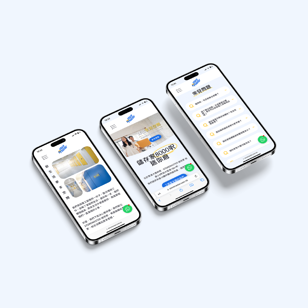
STOREMASTER
WEB DESIGN & DEVELOPMENT | BRANDING | SOCIAL MEDIA | PRINT | DIGITAL MARKETING
-
![]()
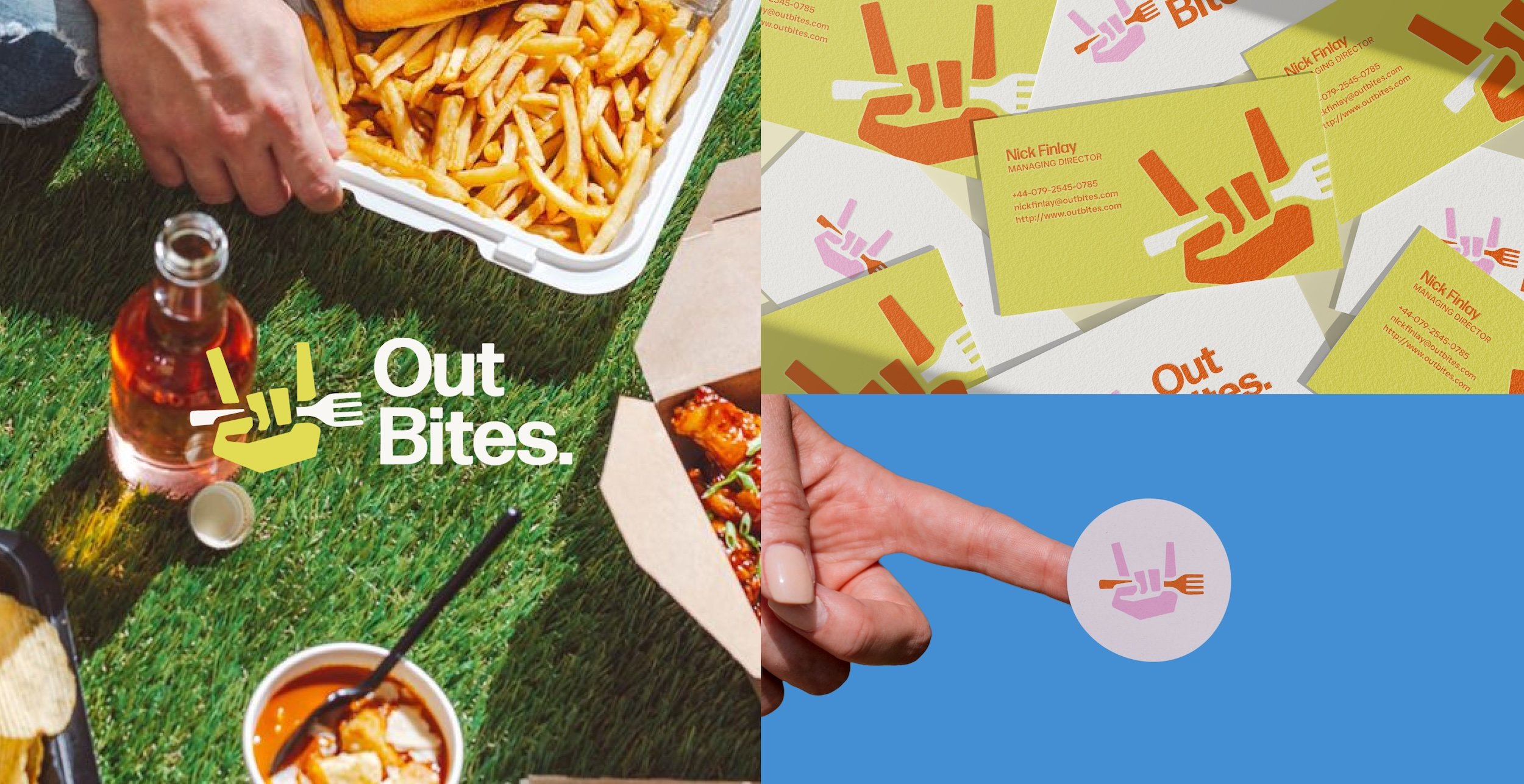
OUTBITES
BRANDING | PRINTS


SEE MORE WORK ON INSTAGRAM