


Play Beyond
E-Commerce
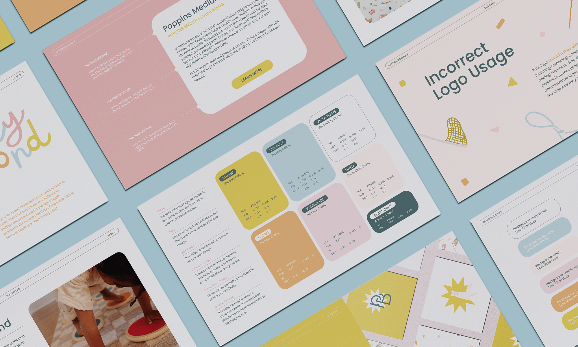
BRANDING
SOCIAL MEDIA
PRINTS
PACKAGING DESIGN
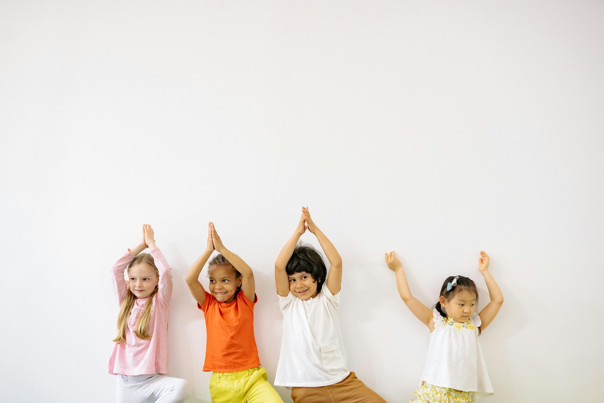
Play Beyond provides a curated platform for the sales and purchase of good quality second hand children’s toys to promote sustainable play and a circular economy. Our goal is to target and attract parents, mainly moms, both sellers and buyers of younger children.
sustainable play
The founders wanted to incorporate the colour Green, to represent sustainability, as well as to use an alpaca mascot. This is because alpaca’s fibre is considered to be the world’s most natural sustainable fibre. They also wanted a playful and approachable brand image without losing the high quality factor.

the design moodboard


INDOOR PHOTOGRAPHY
CUTE ILLUSTRATIONS


SANS SERIF FONT
LIGHTER HUES


BOLD & CURSIVE
COLOURFUL
SUSTAINABLE
✷
FUN
✷
APPROACHABLE
✷
PLAYFUL
✷
HIGH QUALITY
✷
SUSTAINABLE ✷ FUN ✷ APPROACHABLE ✷ PLAYFUL ✷ HIGH QUALITY ✷


adaptive logo suite
4 different logos have been created. The primary logo, a secondary (horizontal) logo, a submark (star alpaca), and a lettermark. An adaptive logo suite is perfect for those who are on multiple media platforms and have numerous client touch points. We decided on a fully hand drawn logo/font to translate the brand’s playfulness, authenticity, and innovativeness.


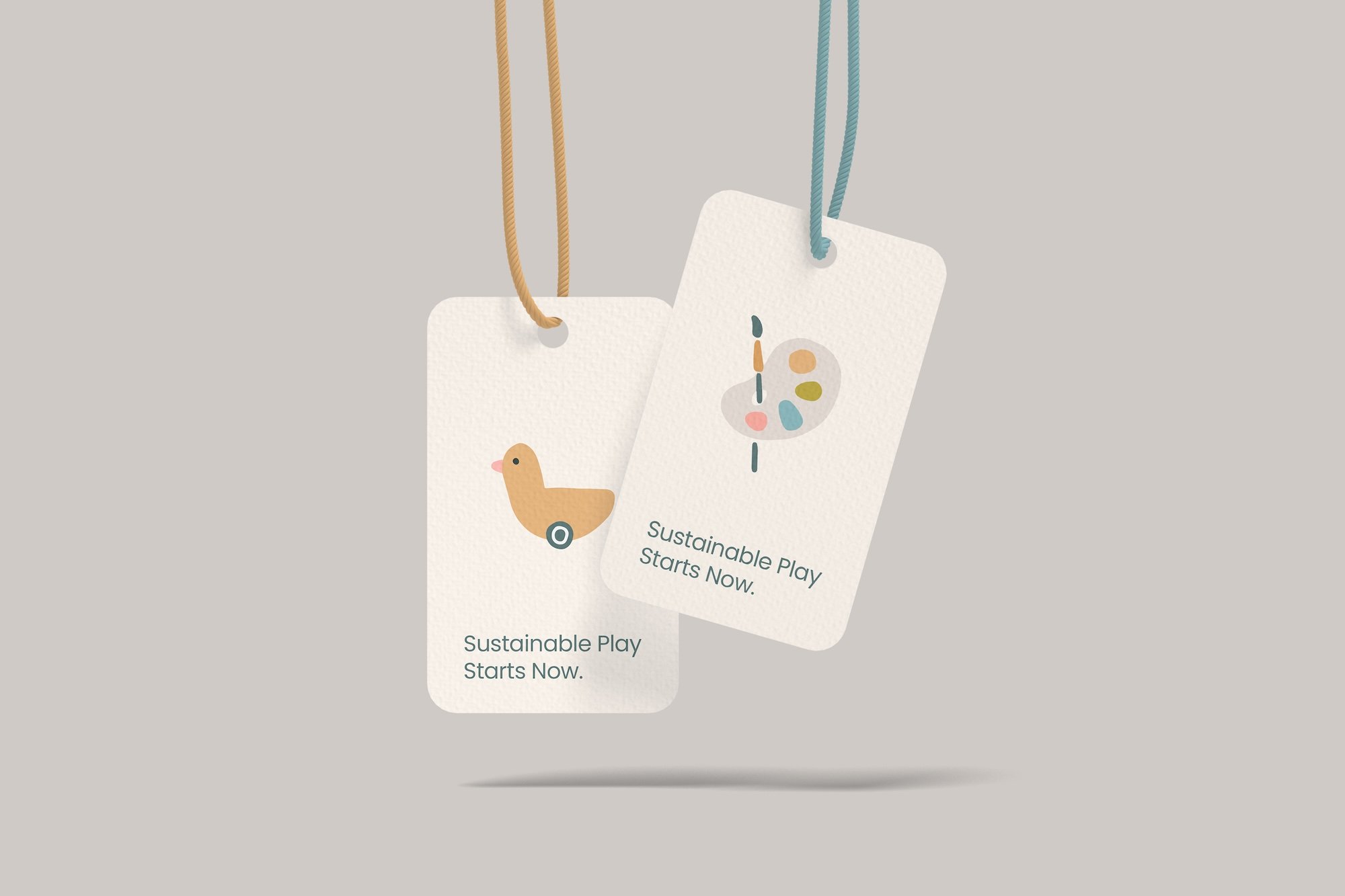
illustrations & patterns
In addition to the alpaca mascot, various illustrations of common toys have also been included. I have made sure to incorporate gender neutral toys to appeal to both girl moms and boy moms. These illustrations can be made into a pattern for different packaging designs.


VIEW MORE
-
![]()
PECCO PECORINO
BRANDING | SOCIAL MEDIA | MENU DESIGN | PACKAGING
-
![]()
ADRIAN NG PHOTOGRAPHY
WEB DESIGN & DEVELOPMENT | BRANDING
-
![]()
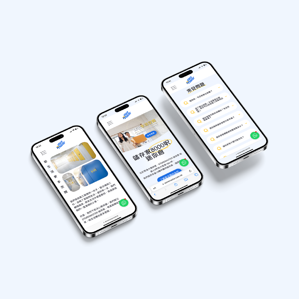
STOREMASTER
WEB DESIGN & DEVELOPMENT | BRANDING | SOCIAL MEDIA | PRINT DESIGN
-
![]()
OUTBITES
BRANDING | PRINTS
-
![]()
PLAY BEYOND
BRANDING | SOCIAL MEDIA | PACKAGING | PRINTS


SEE MORE WORK ON INSTAGRAM


